Hello everyone,
We have been busy... busy... busy! The tech team, which I lead, has been working on some amazing updates for the whole membership area. I was hired along with a team I've worked with for years to polish up and dust off the site among other duties. Today, I'm excited to show off some of the things we have in store for you!
First of all, we wanted to update the look of the site to be more inline with the way things look in the current day. The current membership area is a remnant of ancient web history. The new design uses the newest web standards (css, xml, cdn) which will make the sight easier to navigation and much faster as you move around. Additionally, we tried make good use of space so you didn't have to do quite as much scrolling. Here is a screen capture comparing the old and new designs...

You can get a good idea of the new design too also from the player page. Here's a little screen shot of that. Can you see the changes?
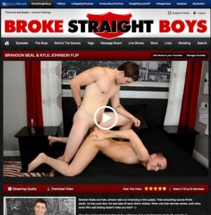
You can obviously see the navigation at the top is a lot more clean looking, but here's a hint on the other big change in the photo above....

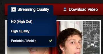
That's the way you stream and pick downloads now but here's the slick new way that takes up a lot less room...
But, this wasn't just about redesigning things. This was very much about giving you all some new and very helpful features to make the site more enjoyable.
For the first time you'll now be able to search the site for anything and everything. It's like our own google built right in.

Type in what you are looking for and our search engine will give you the results! But, we have another really fun way to search too and it's called tags. Every scene is tagged with certain characteristics such as "Rimming", "Uncut Cock", "Foot Worship", etc. Now you can go to our tags page and dynamically filter through almost 1,000 scenes by clicking on tags. Click the tag "Rimming" and only rimming scenes will show up. Click "69" and add it to the filter and then only scenes which have BOTH rimming AND 69 show up. You can limit with as many tags as you want and drill down to exactly what you desire.
Here is a screen cap of me searching for only scenes that were tagged with "Fucking", "Kissing" and "Smooth". Now, we took almost 1,000 videos and narrowed it down to 8 videos that have exactly what I want to see at that moment.

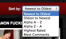
We also allow you to sort general listings (models, scenes, etc.) by numerous methods. Check out these new sorting methods...
We are also adding some new features to our commenting system. You can now leave replys for other peoples comments and show other users how you feel about their comments (like / unlike).
Here is the nested comments look:

And here is the comment liking:

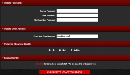
Finally another new feature coming up will be a user control panel where you can do things like change your password, update your email, set a preference for your default video quality etc. Here's a sneak peak:
Well, folks... that's a little preview of some of the changes we have in store for you. The even greater news is that you won't have to wait long to see the new changes. We should be launching the new design very very soon!
We know it's hard to tell a lot just from screen caps, but we hope they give you a general idea of the new exciting look and features we have in store for you!
Thanks so much for everyone who makes comments in these forums about the things you want to do, need to see, etc. We worked as many comments regarding design and functionality into the new version as we could. The new framework will also make it much easier for us to add new features to the site in the future, so keep those suggestions coming!
All the Best,
Bryce
We have been busy... busy... busy! The tech team, which I lead, has been working on some amazing updates for the whole membership area. I was hired along with a team I've worked with for years to polish up and dust off the site among other duties. Today, I'm excited to show off some of the things we have in store for you!
First of all, we wanted to update the look of the site to be more inline with the way things look in the current day. The current membership area is a remnant of ancient web history. The new design uses the newest web standards (css, xml, cdn) which will make the sight easier to navigation and much faster as you move around. Additionally, we tried make good use of space so you didn't have to do quite as much scrolling. Here is a screen capture comparing the old and new designs...

You can get a good idea of the new design too also from the player page. Here's a little screen shot of that. Can you see the changes?

You can obviously see the navigation at the top is a lot more clean looking, but here's a hint on the other big change in the photo above....

That's the way you stream and pick downloads now but here's the slick new way that takes up a lot less room...

But, this wasn't just about redesigning things. This was very much about giving you all some new and very helpful features to make the site more enjoyable.
For the first time you'll now be able to search the site for anything and everything. It's like our own google built right in.

Type in what you are looking for and our search engine will give you the results! But, we have another really fun way to search too and it's called tags. Every scene is tagged with certain characteristics such as "Rimming", "Uncut Cock", "Foot Worship", etc. Now you can go to our tags page and dynamically filter through almost 1,000 scenes by clicking on tags. Click the tag "Rimming" and only rimming scenes will show up. Click "69" and add it to the filter and then only scenes which have BOTH rimming AND 69 show up. You can limit with as many tags as you want and drill down to exactly what you desire.
Here is a screen cap of me searching for only scenes that were tagged with "Fucking", "Kissing" and "Smooth". Now, we took almost 1,000 videos and narrowed it down to 8 videos that have exactly what I want to see at that moment.

We also allow you to sort general listings (models, scenes, etc.) by numerous methods. Check out these new sorting methods...

We are also adding some new features to our commenting system. You can now leave replys for other peoples comments and show other users how you feel about their comments (like / unlike).
Here is the nested comments look:

And here is the comment liking:

Finally another new feature coming up will be a user control panel where you can do things like change your password, update your email, set a preference for your default video quality etc. Here's a sneak peak:

Well, folks... that's a little preview of some of the changes we have in store for you. The even greater news is that you won't have to wait long to see the new changes. We should be launching the new design very very soon!
We know it's hard to tell a lot just from screen caps, but we hope they give you a general idea of the new exciting look and features we have in store for you!
Thanks so much for everyone who makes comments in these forums about the things you want to do, need to see, etc. We worked as many comments regarding design and functionality into the new version as we could. The new framework will also make it much easier for us to add new features to the site in the future, so keep those suggestions coming!
All the Best,
Bryce


